
[微信小程序] 自定义navigationBar顶部导航栏,兼容适配所有机型(完整案例)
前言
navigationBar相信大家都不陌生把?今天我们就来说说自定义navigationBar,把它改变成我们想要的样子(搜索框+胶囊、搜索框+返回按钮+胶囊等)。
思路
隐藏原生样式
获取胶囊按钮、状态栏相关数据以供后续计算
根据不同机型计算出该机型的导航栏高度,进行适配
编写新的导航栏
引用到页面
正文
一、隐藏原生的navigationBar
window全局配置里有个参数:navigationStyle(导航栏样式),default=默认样式,custom=自定义样式。
"window": {
	"navigationStyle": "custom"
}
让我们看看隐藏后的效果:
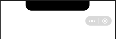
可以看到原生的navigationBar已经消失了,剩下孤零零的胶囊按钮,胶囊按钮是无法隐藏的。
二、准备工作
1.获取胶囊按钮的布局位置信息
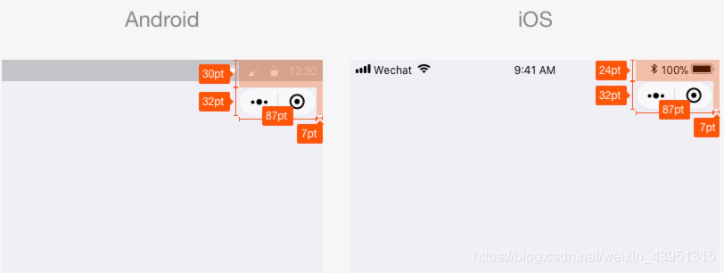
我们用wx.getMenuButtonBoundingClientRect() 获取胶囊按钮的布局位置信息,坐标信息以屏幕左上角为原点:
const menuButtonInfo = wx.getMenuButtonBoundingClientRect();
| width | height | top | right | bottom | left |
| 宽度 | 高度 | 上边界坐标 | 右边界坐标 | 下边界坐标 | 左边界坐标 |
下面是官方给的示意图,方便大家理解几个坐标。
2.获取系统信息
用wx.getSystemInfoSync() 获取系统信息,里面有个参数:statusBarHeight(状态栏高度),是我们后面计算整个导航栏的高度需要用到的。
const systemInfo = wx.getSystemInfoSync();
三、计算公式
我们先要知道导航栏高度是怎么组成的,
计算公式:状态栏高度 + 44。
app.js
App({
    onLaunch: function(options) {
        const that = this;
        // 获取系统信息
        const systemInfo = wx.getSystemInfoSync();
        // 胶囊按钮位置信息
        const menuButtonInfo = wx.getMenuButtonBoundingClientRect();
        // 导航栏高度 = 状态栏高度 + 44
        that.globalData.navBarHeight = systemInfo.statusBarHeight + 44;
        that.globalData.menuRight = systemInfo.screenWidth - menuButtonInfo.right;
        that.globalData.menuTop = menuButtonInfo.top;
        that.globalData.menuHeight = menuButtonInfo.height;
    },
    // 数据都是根据当前机型进行计算,这样的方式兼容大部分机器
    globalData: {
        navBarHeight: 0, // 导航栏高度
        menuRight: 0, // 胶囊距右方间距(方保持左、右间距一致)
        menuTop: 0, // 胶囊距顶部间距
        menuHeight: 0, // 胶囊高度(自定义内容可与胶囊高度保证一致)
    }
})
app.json
{
    "pages": [
        "pages/index/index"
    ],
    "window": {
        "navigationStyle": "custom"
    },
    "sitemapLocation": "sitemap.json"
}
下面为组件代码:
components/navigation-bar/navigation-bar.wxml
<!-- 自定义顶部栏 -->
<view class="nav-bar" style="height:{{navBarHeight}}px;">
    <input class="search" placeholder="输入关键词!" style="height:{{menuHeight}}px; min-height:{{menuHeight}}px; line-height:{{menuHeight}}px; left:{{menuRight}}px; top:{{menuTop}}px;"></input>
</view>

<!-- 占位,高度与顶部栏一样 -->
<view style="height:{{navBarHeight}}px;"></view>
components/navigation-bar/navigation-bar.json
{
  "component": true
}
components/navigation-bar/navigation-bar.js
const app = getApp()
Component({
    properties: {
        // defaultData(父页面传递的数据-就是引用组件的页面)
        defaultData: {
            type: Object,
            value: {
                title: "我是默认标题"
            },
            observer: function(newVal, oldVal) {}
        }
    },
    data: {
        navBarHeight: app.globalData.navBarHeight,
        menuRight: app.globalData.menuRight,
        menuTop: app.globalData.menuTop,
        menuHeight: app.globalData.menuHeight,
    },
    attached: function() {},
    methods: {}
})
components/navigation-bar/navigation-bar.wxss
.nav-bar{ position: fixed; width: 100%; top: 0; color: #fff; background: #000;}
.nav-bar .search{ width: 60%; color: #333; font-size: 14px; background: #fff; position: absolute; border-radius: 50px; background: #ddd; padding-left: 14px;}
以下是调用页面的代码,也就是引用组件的页面:
pages/index/index.wxml
<navigation-bar default-data="{{defaultData}}"></navigation-bar>pages/index/index.json
{
    "usingComponents": {
        "navigation-bar": "/components/navigation-bar/navigation-bar"
    }
}
pages/index/index.js
const app = getApp();
Page({
data: {
// 组件参数设置,传递到组件
defaultData: {
title: "我的主页", // 导航栏标题
}
},
onLoad() {
console.log(this.data.height)
}
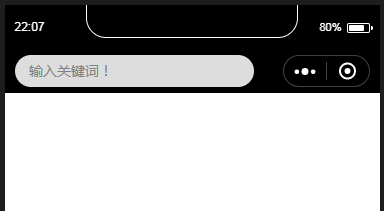
})效果图:
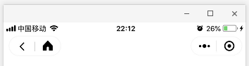
下面附几张其它小程序的效果图,大家也可以尝试照着做:

总结
本文写了自定义navigationBar的一些基础性东西,里面涉及组件用法、参数传递、导航栏相关。
由于测试环境有限,大家在使用时如果发现有什么问题,希望及时反馈,以供及时更新帮助更多的人!
大家有什么疑问,欢迎评论区留言!

本站部分文章、数据、素材收集于网络,所有版权均归源网站或原作者所有!
如果侵犯了您的权益,请来信告知我们下线删除,邮箱:357234902@qq.com

![[微信小程序]实现小程序跳转其它小程序](/static/upload/image/20220417/1650190809205463.jpg)
![[微信小程序] 获取地理位置](/static/upload/image/20220424/1650811051649686.jpg)
![[微信小程序] 参数传递、参数获取,获取当前页面url](/static/upload/image/20220417/1650188085259147.jpg)
![[微信小程序] 消息提示框,wx.showToast、wx.showModal、wx.showLoading](/static/upload/image/20220424/1650811357283407.jpg)